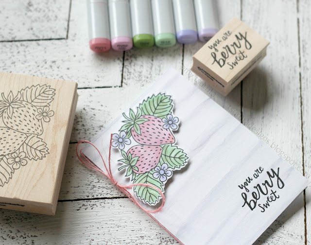
Happy Monday! I hope you had a great weekend, I did. It always goes by so quickly, doesn’t it? I’ve been noticing a couple things have changed in my crafting ‘habits’. I’ve been using my copics more! Have you noticed a slight shift in my color palette lately? I’ve been definitely gravitating towards soft pastels:
Ordinarily that Impress Strawberry would be rich red…oh boy, I hate working with red copics…so unforgiving. I went with pale pinks…
I did use my pale grey Zig and a water saturated paintbrush to color up my skinny cardbase (5 x 3.5 inches). I was inspired by all the wonderful Impress note cards.
Don’t you love that sentiment? That’s from Impress too. For non-locals, if you every visit Seattle you need to pop into one of the two Impress locations. They have the best products AND inspiration…seriously. I know how lucky we are to have such a wonderful brick + mortar shop.
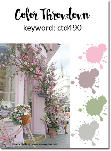
I was inspired by the Color Throwdown:
Thanks for stoppin’ by and have an awesome week!


12 thoughts on “Berry Sweet!”
Love that soft background against your gorgeous coloring Amy!
This is gorgeous! LOVING those berries!!!!!!!!
Love the soft colors!
Amy this is beautiful! Love the soft tones and the background is amazing~
So berry sweet–I'm lovin' the pastels, too!
so sweet card!
Such a berry sweet card Amy!
This is so beautiful, Amy! Loving the soft colors!
These berries are MUCH better than the other ones!!!! LOVE the sweetness!!! The watercolor = Ooooh and ahhhhs!
very sweet, amy … I love the watery stripes!
=]
SO adorable! Love your berries, love your stripes! And I am a huge fan of your shift in color palette…… but then I'm a huge fan of everything you do! <3
So totally berry sweet card!!!
Comments are closed.